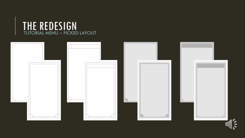
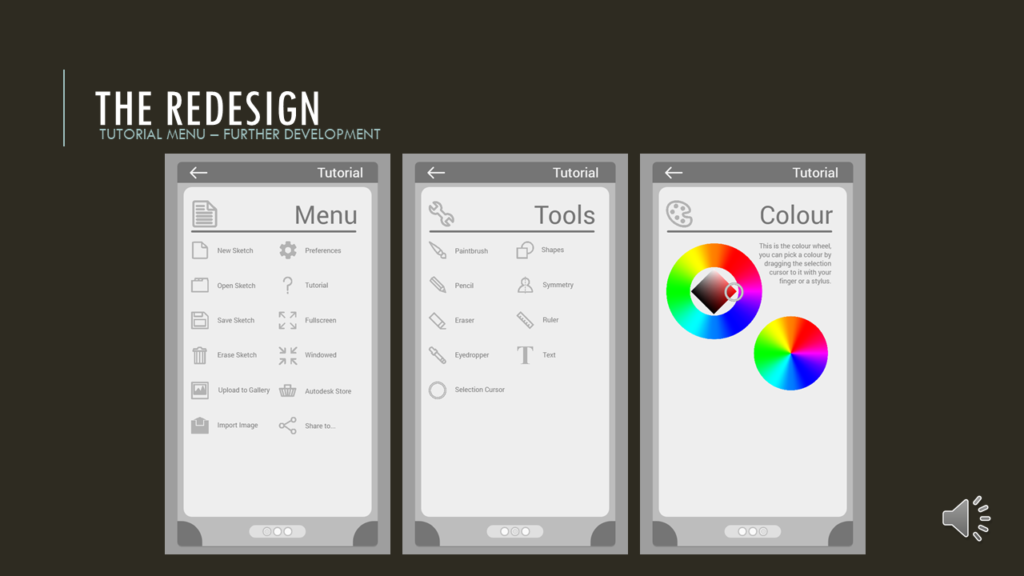
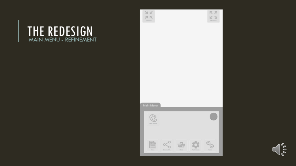
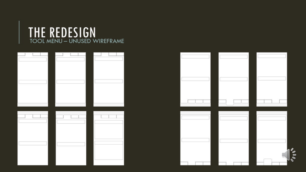
This is going to be a big one, so strap in folks!
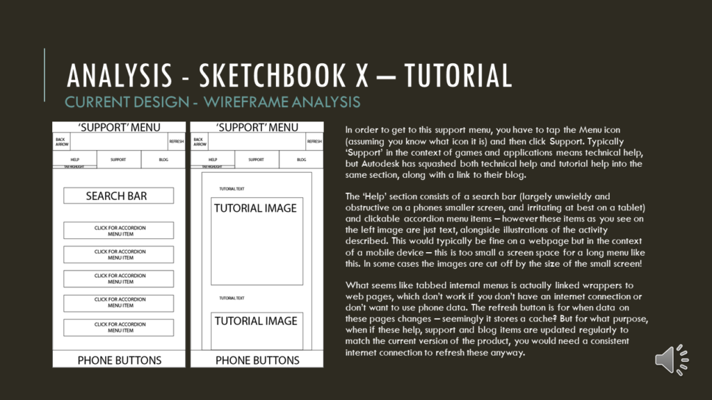
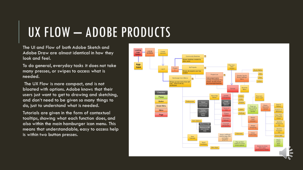
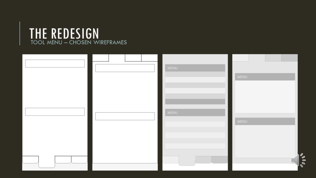
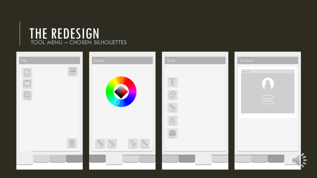
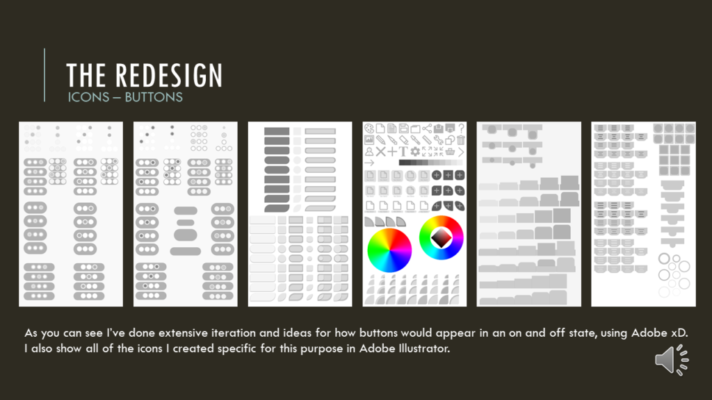
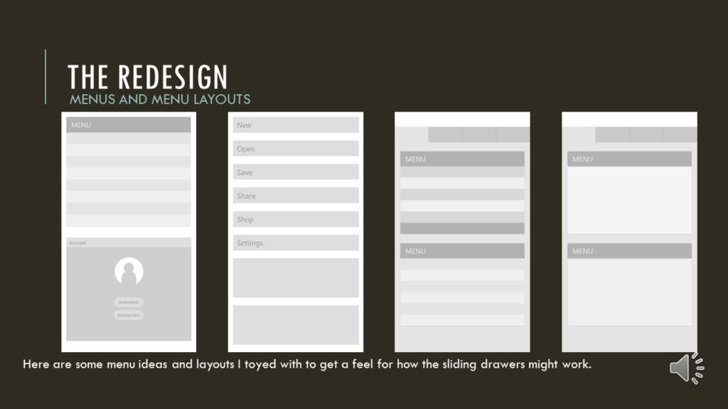
My journey into accessibility started around 7 years ago, at university. A little module that tasked us with selecting a game or an app to redesign the UI, including in-depth UX research and explorations.
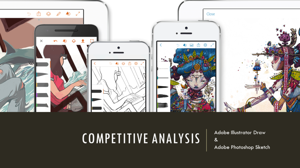
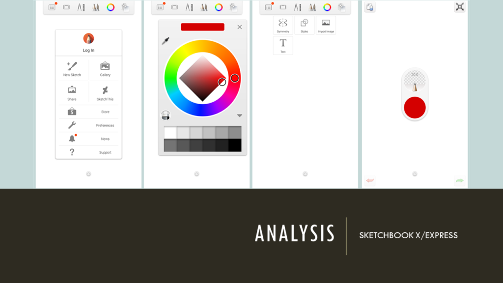
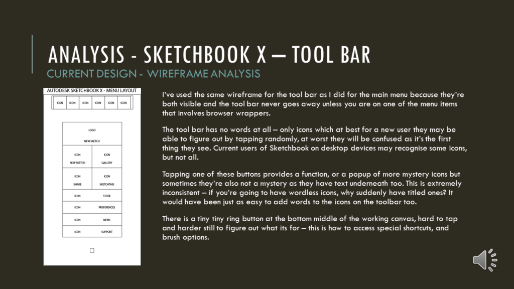
Well, I can tell you, my little heart soared throughout this whole module, because I decided to redesign Autodesk Sketchbook X. I also decided to look into making it both more cognitively and colour-blind accessible.
Many devs first port of call for colour-blind accessibility is colour filters, simulations that don’t actually resolve the barrier that is in place. I know a fair few colour-blind folks who work in creative industries, so the idea of running a filter over everything and just dusting my hands off felt disingenuous to my goals.
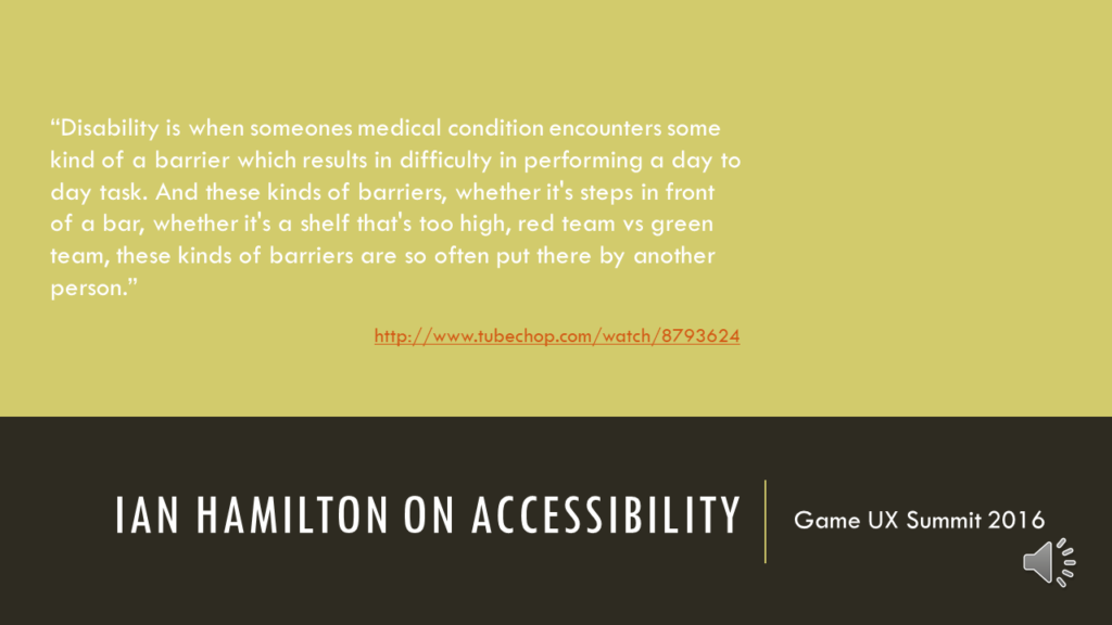
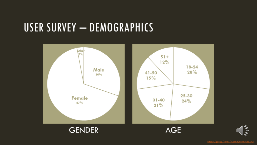
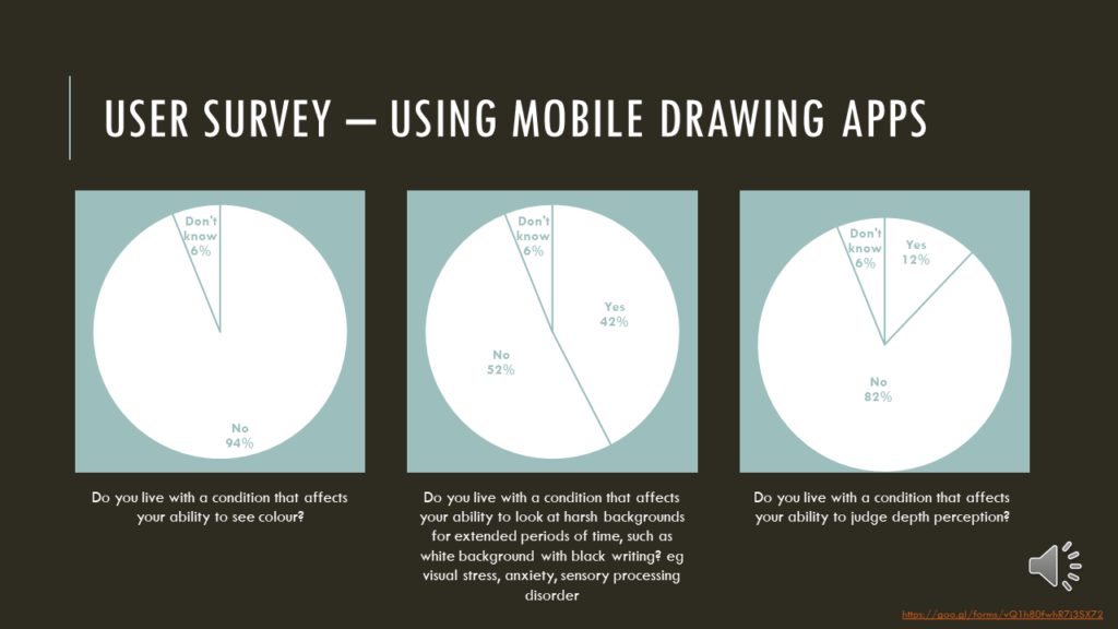
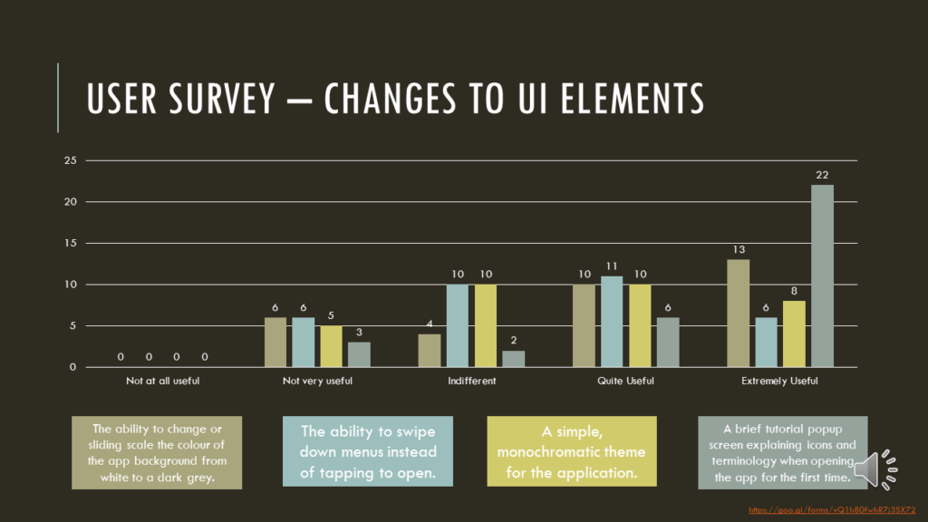
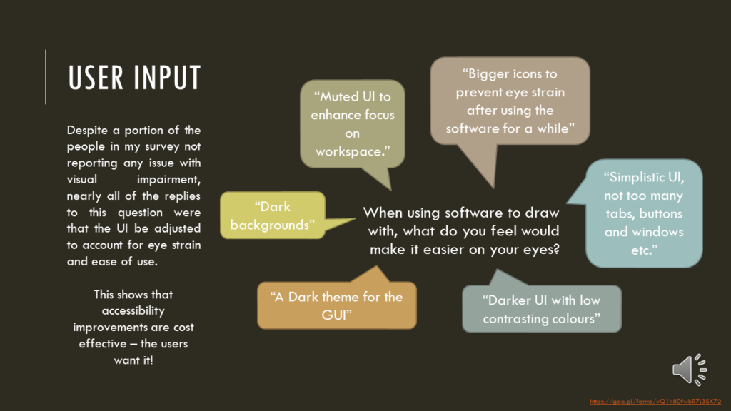
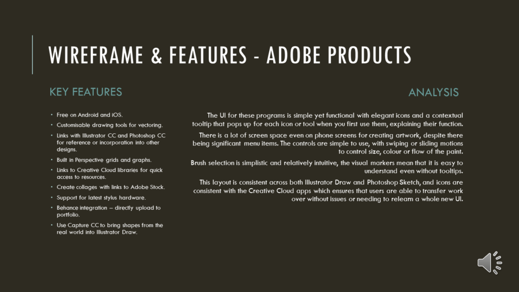
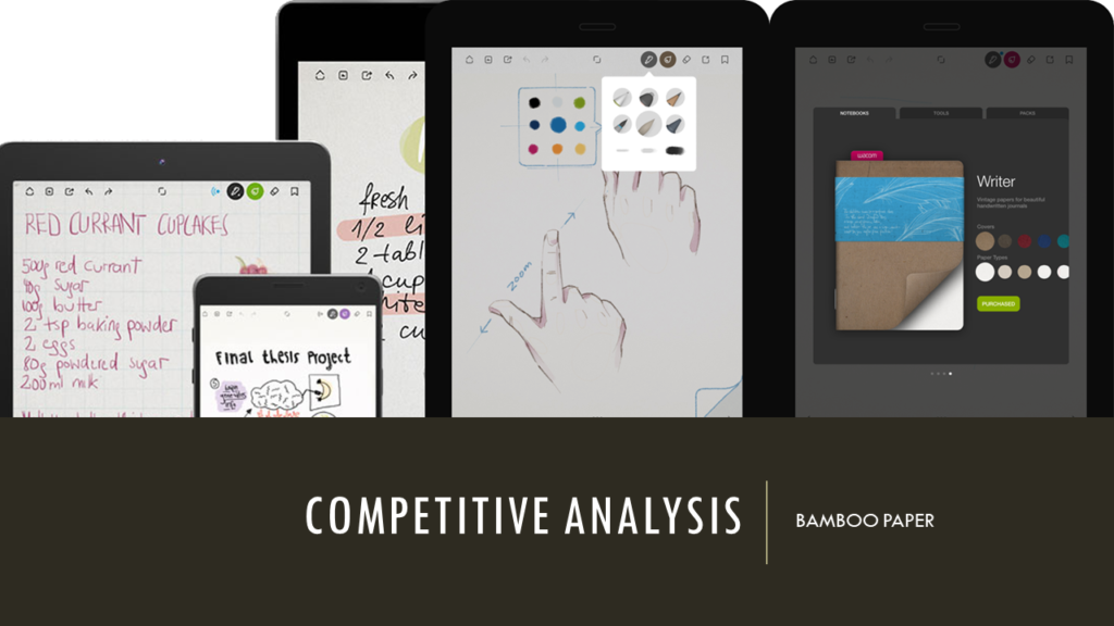
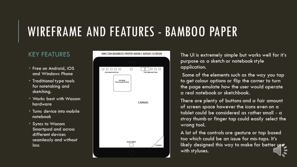
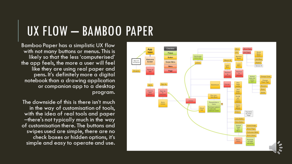
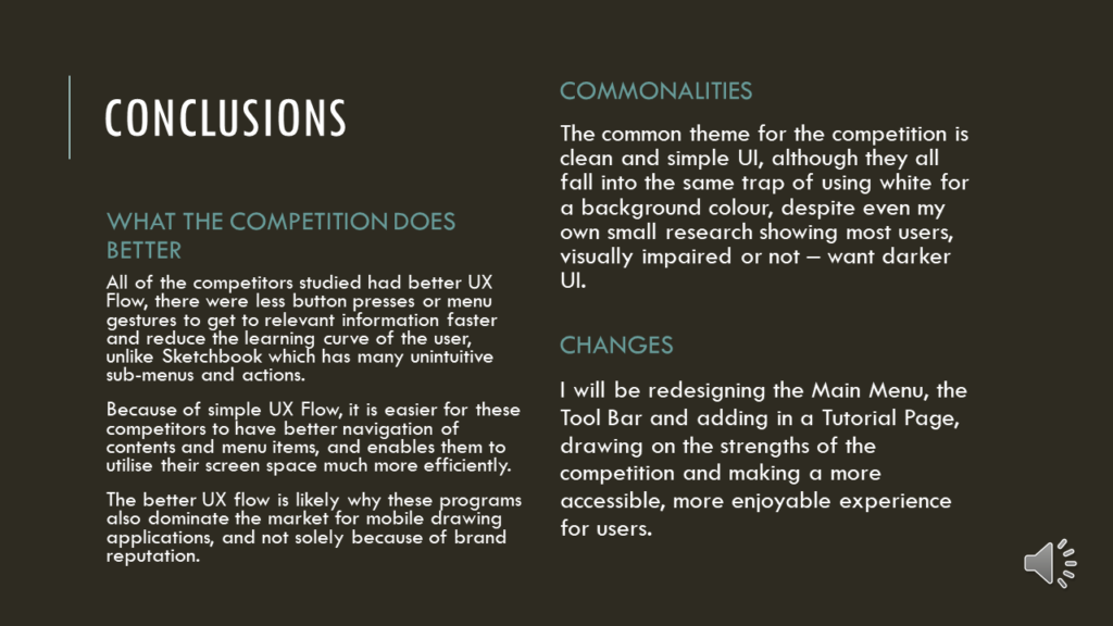
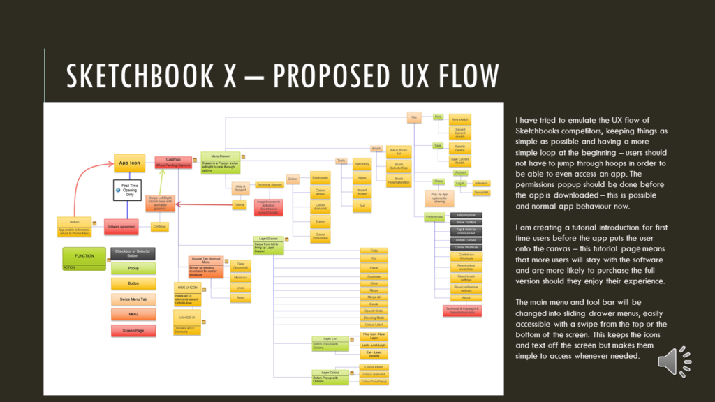
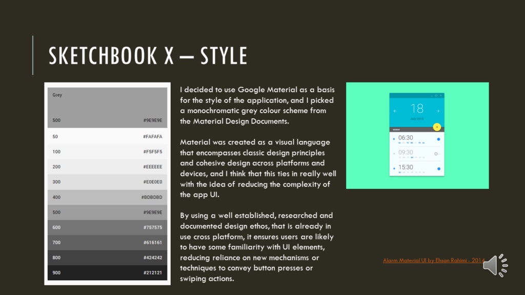
Unfortunately a lot of the research I did is lost to time and graduation, but I do have all of my slides from my final submission, which includes the survey results that informed my decision making process for the final result.
If I was to do this again now, 7 years on…I’d increase the contrast a lot more, and look at improving the cognitive user flow even more to ensure an easy time using the app.
The gallery should be in slide order, hopefully, and you can access a very janky PowerPoint mock-up of the redesign below too. Adobe XD was still a little wee baby app at that time so we did things the very rough and ready way!


